The Charter Building and Thames Tower – A tale of two transformed office buildings – Architects Datafile
Major internal and external renovations of two very different office buildings were driven by a desire to provide environments that workers will enjoy, flexible rentable workspace and collaborative communities for businesses. Jess Unwin finds out more.
Architectural makeovers are breathing new life into two office buildings which were both suffering from .dated and tired design, greatly increasing their asset value for the future.
The Charter Building and Thames Tower, situated at the heart of Uxbridge and Reading town centres respectively, have both been stripped back to their structural framework and are now gradually re-emerging with new personalities – both outside and inside.
Orchestrating the transformational changes are architects dn-a. Founding directors Stuart McLarty and Jai Sanghera knew from the outset that the projects presented very different challenges.
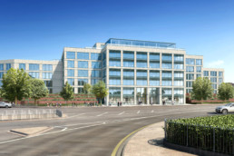
With The Charter Building, the team took on a 1980s groundscraper, a ‘fully glazed box’ which was the former UK headquarters of Coca-Cola, whereas the original Thames Tower structure was an 11-storey mini-skyscraper typical of 1970s commercial architecture, with smoked glass, bronze cladding and chamfered corners.
Fundamental targets
Notwithstanding the differing set of challenges the developers, a joint venture between Landid Property and Brockton Capital, gave dn-a the same fundamental targets for both buildings.
First, repurpose them in such a way as to increase the net rental space and ensure that the workspace is more flexible and conducive to the modern working practices of the more forward-thinking and demanding tenants.
Next, create contemporary interior designs to attract high-calibre companies by offering them a modern workspace ambience that will in turn help them recruit the best staff. A further target common to both buildings was to introduce technologies and materials to improve the green credentials of the buildings through BREEAM and EPC rating.
Finally, a key goal linking the new design ethos of the two projects is, as McLarty puts it, to produce office buildings that are “trying to reach out to the community and offering something to the surrounding urban environment”.
This last objective is a real contrast to his description of the way The Charter Building used to feel:
“Heavy metal railings and brick piers around the perimeter made the building appear fortified and divorced from the rest of the public realm, even though it’s northern entrance is just metres from Uxbridge town centre and its tube station. It was a bit like a castle with a moat around it.”
Architect d-na’s new design scheme replaces the old narrow northern entrance – guarded by forbidding ‘brick sentinels’ – with an open courtyard approach. There are changes at the building’s southern entrance too (which faces the Uxbridge ring road). McLarty says:
“What we started with was a meagre, unfriendly entrance. To address that we’ve added a new five-storey block that brings the building back onto the street with a proper, defined second entrance.”
Although generous glazing to the south exploits impressive views, the overall aim has to been to significantly reduce the amount of glass in the building’s new facade, replacing it with a champagne-coloured terracotta cladding system. McLarty says:“
The previous mirrored glass box was more at home in a green field business park, not an urban setting like this. The new facade gives the building both gravitas and warmth.”
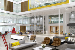
Inside, dn-a is making an even grander design statement by creating an internal ‘street’ that runs at ground floor level for more than 100 m, from the north to south entrance. The changing height of this street – sometimes single-storey, sometimes three-storey and soaring to five storeys at the central atrium – is inspired by the architectural concept of ‘serial vision’.
Jai Sanghera explains further:
“Serial vision is synonymous with Italian piazzas – the idea of going through a tall narrow street and then suddenly the space opening up into a piazza. That’s how we see this animated street working at The Charter Building.”
McLarty adds:
“You move from intimate spaces to dramatic daylit lightshafts. It’s a rollercoaster journey which is terrific in adding interest and making the building out of the ordinary.”
According to Sanghera, the designers wanted this multi-let building to be a “collaborative environment, because that’s the way modern companies operate. The street is very important in creating a community feel as opposed to dead, echo-filled, empty spaces. The ambience will be more hotel lobby than corporate office and the idea is to spread that the full length of the building.”
“Instead of having to create all their meeting rooms and break-out spaces within their own floorspace,” he continues, “tenants can share areas of collaborative working along the street. There will be food and coffee concessions, zones for quiet working and meeting points.”
The central atrium is not only the jewel in the crown of this shared space but is also a legacy of the building’s old design that has helped increase rental space. Sanghera explains: “The centre of the building featured an open, landscaped courtyard that was lifeless and underused.
“The solution was to put an atrium roof over it. In addition, we added a penthouse level floor. Together with the five-storey block at the southern entrance, these added an extra 50 per cent of rentable space.”
Ensuring that space can be broken down into sub-divisible lots of varying sizes, was an important goal for the interior design, broadening the appeal of the building to different types of tenants.
Green features include coated glazing to help ensure internal temperature control, suspended LED light fittings, an underfloor displacement ventilation system, rooftop photovoltaic panels plus sedum green roofs.
Finally, as McLarty points out, re-using the majority of the existing building, rather than demolishing and starting again, is a carbon saving in itself.
Cladding inspired by Guaranty icon
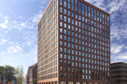
At Thames Tower, dn-a is not only redressing the building in red terracotta cladding, the designers are also adding four additional floors of rentable space. The concept is to create an iconic structure that is visible from both the redeveloped Reading railway station and the main high street.
The cladding choice recognises the fact that Reading’s nearby Victoria Street has some of the finest examples of terracotta building facades but the design is also inspired by the Guaranty Building. Sanghera says:
“The Guaranty Building, the first modern skyscraper designed by Louis Sullivan in Buffalo, New York, is of very similar proportions with beautiful filigree terracotta details. Hence the concept for Thames Tower is a 21st century version of that.”
He continues:
“We’re giving the tower a base by reinforcing the double height colonnade at street level with a double height reception area. A two-storey window detail at the top balances this and crowns the building.”
The chamfered corners are gone and the use of two types of terracotta tile – one a flat face, the other fluted – will add detail and accentuate the height of the building. The result, says McLarty, should transform Thames Tower from “a pretty ugly duckling into a beautiful swan”.
Internally, Sanghera adds, the quality of the existing ‘beton brut’ concrete frame and floor slabs, have inspired dn-a to strip back the ceilings and choose exposed services and suspended light fittings, which are the interior ‘piece de resistance’ and hence treated as a fifth elevation. On the new floors, the steel structure has been left exposed.
McLarty says:
“These changes in the aesthetics – the floors also change in volume and height as you go up through the building – adding to the choice for prospective tenants so it’s not the same boring, ‘vanilla’ space.”
Office space throughout the multi-let Thames Tower is being designed to provide everything that is needed for the modern commercial tenant, including the flexibility to customise everything from the design of the kitchen and communal areas to the occupation density of the workplace.
Collaborative working spaces
In common with The Charter Building there’s an ethos of trying to create a community in the building and collaborative working spaces, as McLarty confirms:
“The penthouse area features a roof terrace with views across the Thames Valley and the idea is to create community space up there so that even if you only have some space on lower floors you still have access to the terrace.
“It will be an added amenity, providing more interaction with the building and integration of people, giving occupiers more than ceilings, floors and walls.”
Sustainability features are similar to those at The Charter Building but also include the latest lift control technology that more efficiently manages lift movements, taking you to the floor you want to go to – and only that floor.
Referring to both The Charter Building and Thames Tower, Sanghera says that the driver was to ensure that pleasant environments were created for staff:
“People spend an inordinate amount of time working so it’s not just about creating a working environment, they want to enjoy the process too.”
He asserts that remembering the client’s motivation is a key part of this:
“Architects need to keep a firm focus on the end game, which is to attract the best tenants in order to reinvigorate and inject life back to the building.”
Read the full article on the Architects Datafile here


