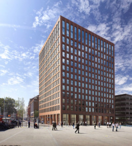
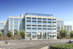
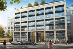
The Charter Building, Uxbridge and Thames Tower, Reading are both prime examples of worn, under-used and dated 1980’s buildings. Now under a year away from completion we take a look at the dramatic changes that ensure both developments sympathetically blend into their surroundings, whilst also enhancing their own style, and providing them with a fresh new image.
Terracotta
To achieve this goal dn-a architects opted to use a traditional material that has evolved into a dynamic, versatile and bespoke cladding solution; Terracotta.
Contemporary terracotta tiled rain-screens have been used extensively throughout the UK and have opened up a completely new dimension in building design; one that offers flexibility and improved environmental performance. Built of individual components it also offers outstanding system integration which makes it ideal for these landmark office refurbishments.
The Charter Building
On The Charter Building, dn-a saw an opportunity to completely remove and strip back the buildings’ bland, unsustainable curtain walling to its structural frame. This allowed for the design to move away from the dated ‘fully glazed box’ look of the existing structure, utilising a more contextual architectural language through the use of Terracotta. This will create a more sympathetic building, more in-keeping with the adjacent conservation area and listed buildings and give The Charter Building a fresh new image.
To ensure the buildings’ environmental performance was improved a more appropriated solid to glazed percentage ratio of 35-40% was adopted. This is vital to help deliver a façade that is well balanced; delivering both better environmental performance whilst also ensuring good quality daylight and solar gain.
Thames Tower
Terracotta will also be used to clad Thames Tower in Reading. Here both red terracotta and red Berkshire bricks are prevalent throughout the town, the old Town Hall and Queen Victoria Street being fine examples. Taking inspiration from this architectural heritage, dn-a have reinterpreted these architectural materials in a contemporary manner.
Great consideration has been given to the amount of detailing to ensure the façade doesn’t have a flat and ‘cheap’ appearance.
This has been achieved by providing a strong reveal depth and timelessness to the simple rhythm of the glazed elements of the façade. In particular the detailing of the window sill, jamb and head of the window openings. This detailing is vital to achieve a successful design; providing the richness and texture required of this stripped and simplistic approach.
The choice of a smoothed faced tile on vertical columns contrasting with a grooved tile at spandrel locations on the façade further enhances the verticality of the building which is complimented by the additional four floors.
The final result will be a warm and striking building, which brings colour and richness to the station square.


